Point of View Magazine

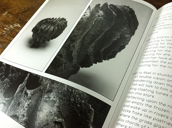
Photo Directed and designed layout for Harper College's Point of View magazine publication. —— EDITOR'S STATEMENT We put ample thought into this issue and we made a lot of changes from the conventional layout. Things like no page numbers, a bare-bones design, and multiple thumbnails all had purpose in this issue’s design. My main goal for this issue was to create the feel of not a magazine, but of a gallery book. I wanted the readers and viewers to feel as if they were flipping through the walls of an art museum with a flick of their finger. Each page was designed to look like the art work is hanging on a wall at a gallery; taking out page numbers made that possible. One would not see numbering or something implying an order on a wall. Because of the lack of pagination, I simply designed the table of contents to be in chronological order with the names and titles aligned with small thumbnails of the pieces. The thumbnails allow the viewers to appreciate the detail and craftsmanship implemented by the artist, giving the viewer a more realistic experience.


